Purple Kow
Restaurant Rebrand
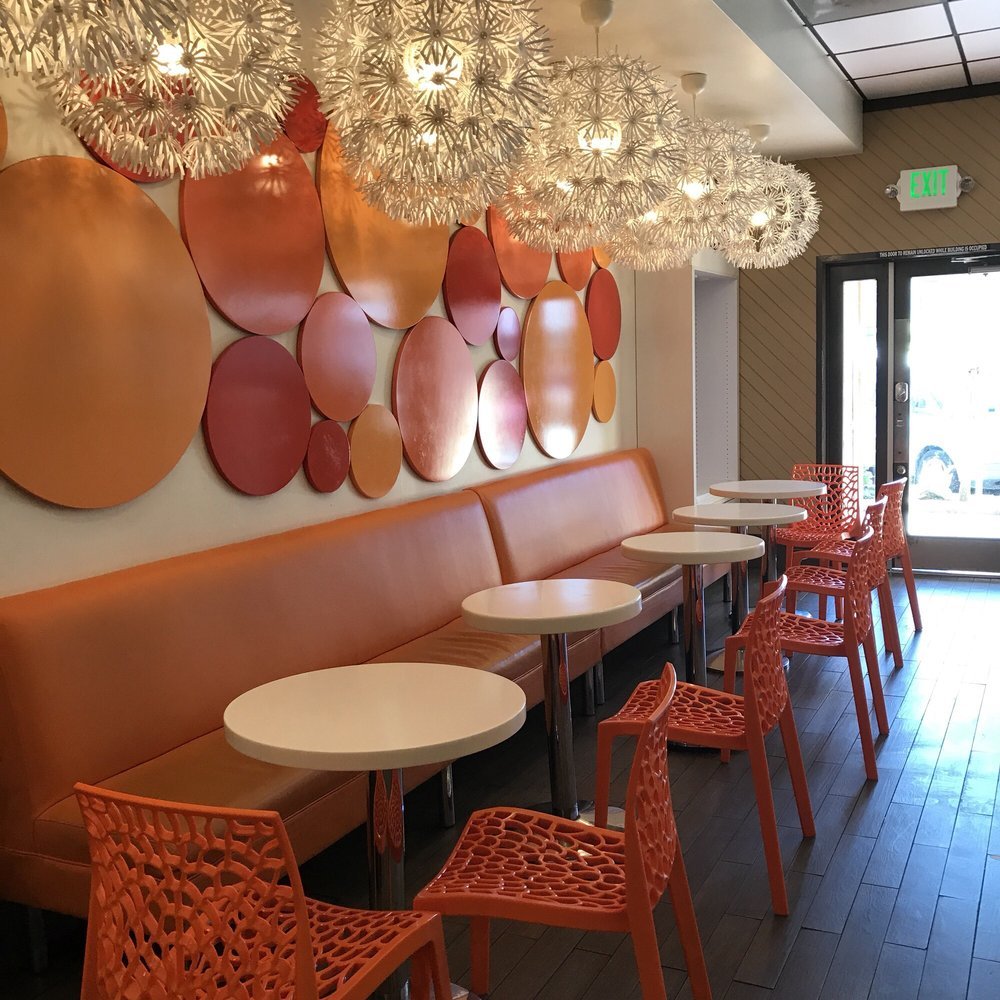
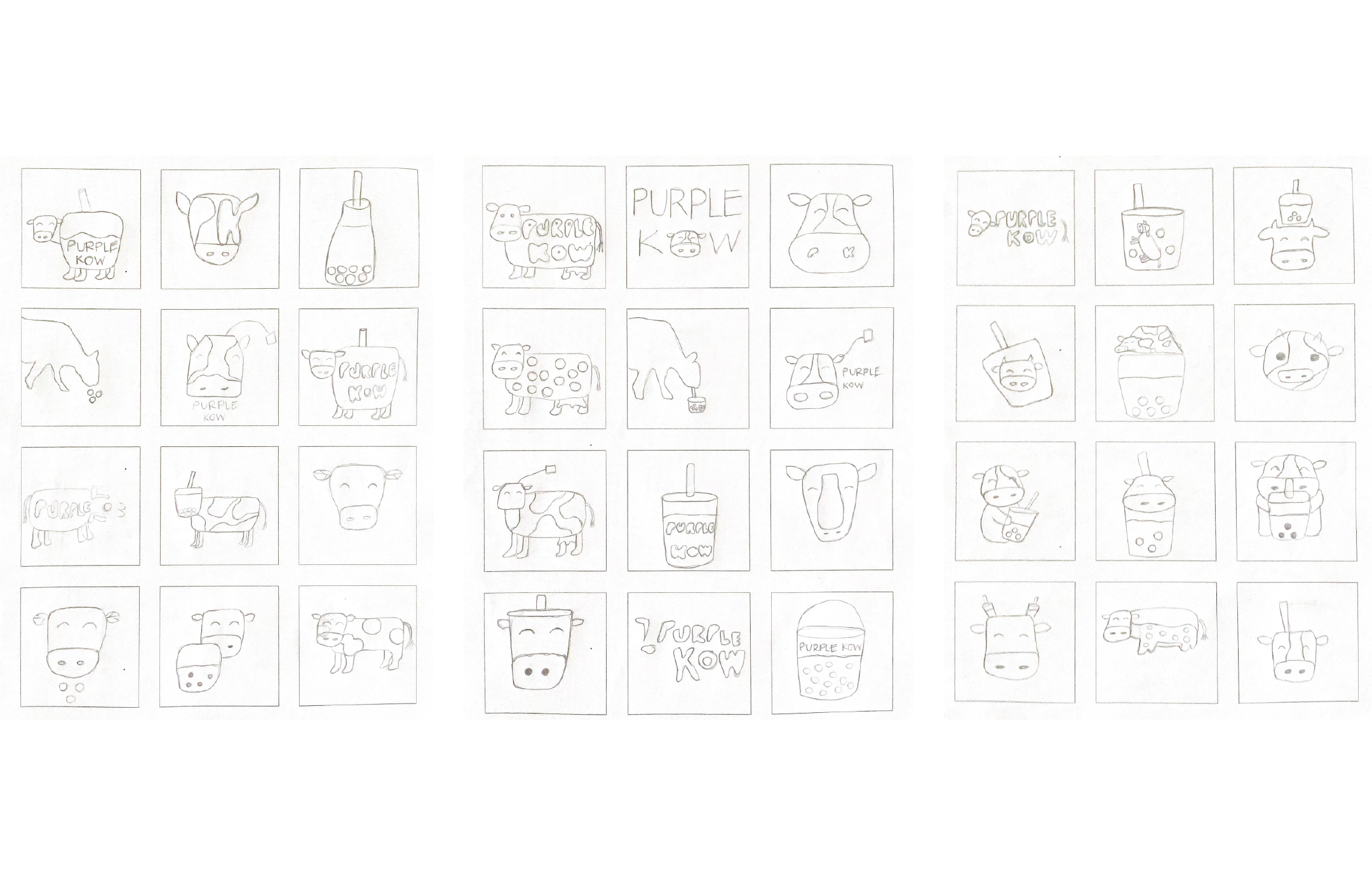
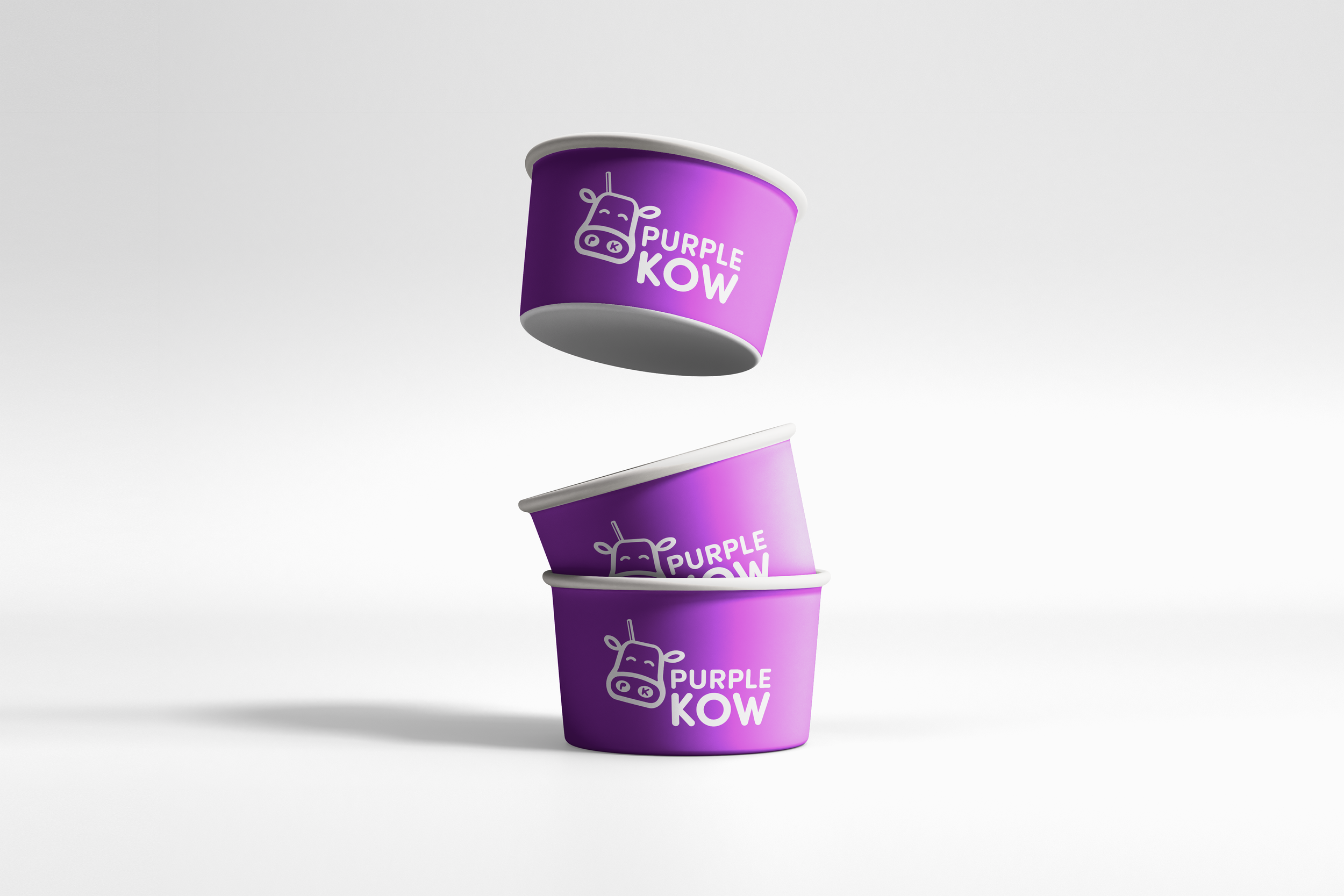
Purple Kow is a staple boba, snack, and dessert restaurant located in the Outer Richmond District of San Francisco. Its colorful and friendly atmosphere is reflected in its wide assortment of milk tea combinations and bright shop interior. Its outdated logo and branding needed a refresher. This logo and brand redesign, an integration of a cow and milk tea, reflects the exciting and fun mood the shop has.
Scope: Brand Identity, Logo Design
Research—time for a change!
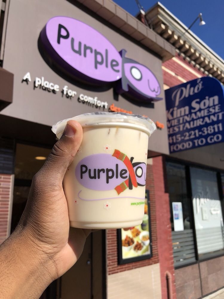
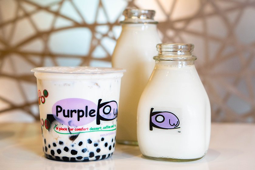
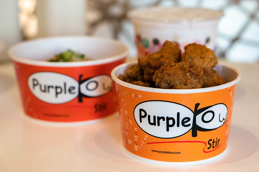
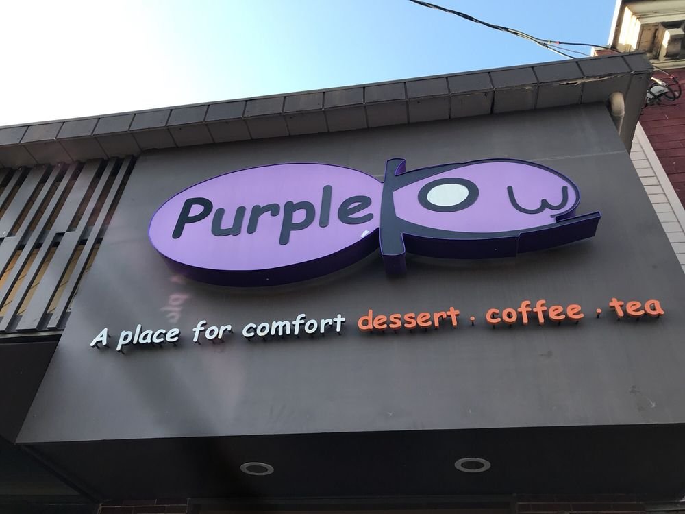
Purple Kow’s style and identity is playful, friendly, and casual. Its current logo features its name inside an abstracted, illustrated purple cow, with the letter “k” stylized as the cow’s ears and the letter “o” as its eyes. The cow illustration itself is oversimplified to the point where it is not clear what it is portraying, and is overall uninspiring and does not match the vibrant interior of the shop. The purple shade used is a solid color choice, but when paired with the illustration and the Comic Sans typeface used for the logotype, it is not very stimulating.
